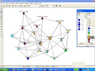
What do you see? Probably the centrality of the orange square and orange triangle. (And if you're really observant, the lack of connections between like-colored nodes.)
Redraw this same network another way and here's what we get:
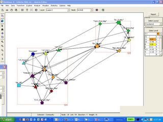
Suddenly we can see the orange square is central in more ways than one. Not only does he have many connections, but he also is far and away the primary broker between the two major clusters in the network.
This kind of insight jumps out when using the "explore" capabilities of NetMiner. In the above picture, we are exploring clusters of the network using Girvan and Newman's community algorithm. To the far right of the picture, you can just make out the "select level" dropdown. Here Netminer displays all possible ways we can cut our network into relatively self-contained communities; it highlights the most significant cuts with orange and yellow. By viewing significant cuts, we can get a quick intuitive look at who is talking with whom, who is not talking with whom, and who are the brokers connecting them.
Redraw this same network another way and here's what we get:
This kind of insight jumps out when using the "explore" capabilities of NetMiner. In the above picture, we are exploring clusters of the network using Girvan and Newman's community algorithm. To the far right of the picture, you can just make out the "select level" dropdown. Here Netminer displays all possible ways we can cut our network into relatively self-contained communities; it highlights the most significant cuts with orange and yellow. By viewing significant cuts, we can get a quick intuitive look at who is talking with whom, who is not talking with whom, and who are the brokers connecting them.


No comments:
Post a Comment