Organizational network analysis provides intuitively compelling pictures of how work really happens, giving us a handle on slippery intangibles that drive the future success of an enterprise.
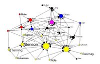
Although this kind of intuitive analytical power has very wide appeal, its usefulness is limited right now by the unwieldy software tools currently available.
Deep down, making good simple network pictures is inherently complicated, but using network visualization software doesn't have to be. Progress is being made every day. See the newly updated list of SNA software in the right sidebar for some great examples. (And please let me know if I'm missing something.)
Even with the simplest of these tools, my non-technical clients often get hung up right away with the basic task of getting the data in. We power-users can easily forget how hard it was to build our first network, until we see someone else learning for the first time.
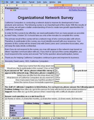
Here's an Excel spreadsheet utility my clients and I find helpful. I now make it freely available, in the hopes that more people will enjoy the benefits of seeing the big picture of the network perspective.
The spreadsheet includes three worksheets. One worksheet is the actual survey, which can be modified to suit the specific project. It automatically incorporates the names of the survey population into a drop-down list.
 After distributing the survey via email, collected responses can be pasted in any order into a "compiled survey" worksheet:
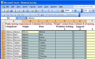
Then an "automatrix" worksheet converts th
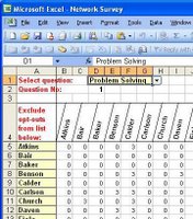 e compiled results into square matrices that can easily be pasted into available network analysis tools. The matrix calculator makes it easy to manage who opts in or out of the survey, and it provides access to multiple relationships.
If you'd like a copy of the spreadsheet, which includes a copy of a great California Computer case study (permission granted by David Krackhardt), you can download it here.
Copyright (c) 2005-2009 Connective Associates, except where otherwise noted.


2 comments:
Awesome - Bruce - this is what I think we'll see having an enormous impact for sales-cultures.
For us conceptual thinkers - having pictures to show (instead of Power point slides and text) makes a tremendous difference in how we are perceived.
When i was looking for work, i had my wife draw up social networks on adobe illustrator to give the interviewers a visual representation of what i brought to the table.
It saves a lot of time in explaining that quality of contact and referral is more important than number of cold calls.
It also helped explain how to use the cold call to find warm contacts.
Visual images matter - think of the difference between looking at a job location on google maps and looking at a city description on a job board. Visualizing driving to work gets people to think about driving to work - once they think about it, I'm in my sweet spot as a recruiter.
Bruce. What a great holiday present for your readers. Count me in!
mal.watlington@gmail.com
Post a Comment